Packaging Concept | Drinking Mixes
PROJECT DESCRIPTION
Our team set out to expand our drinking mix line. Expanding into the high end Cafe at Home drink mixes and mixes designed specifically for kids. Each line would need a distinct style and tone but had to remain within the Lakanto brand style.
COMPANY
Lakanto
YEAR
2021
CREDITS
Jon Bybee | Creative Director
Kaila Poulsen | Art Direction


Rainbow of Benefits
Expanding out this product line, I ultimately didn’t want to depart too far from Lakanto’s visual style. I settled on a more reserved but elegant mountain and clouds pattern. For the Cafe at Home high end mixes such as Chai Latte and Mocha Latte I applied warm gradients. The more general mixes had a matte green and brown applied them.


Dressing the Part
As I was designing the Cafe at Home line, I wanted finesse the current branding elements we had. These had to dress the part to be a high end Cafe at Home line and not only had to be appealing on shelves but on a counter or pantry in a family’s home. So, I created a simplified clouds and mountain pattern along with a few Chinese lattice patterns with a splash of color. Just because it is high end, doesn’t mean it can’t be expressive or joyful.
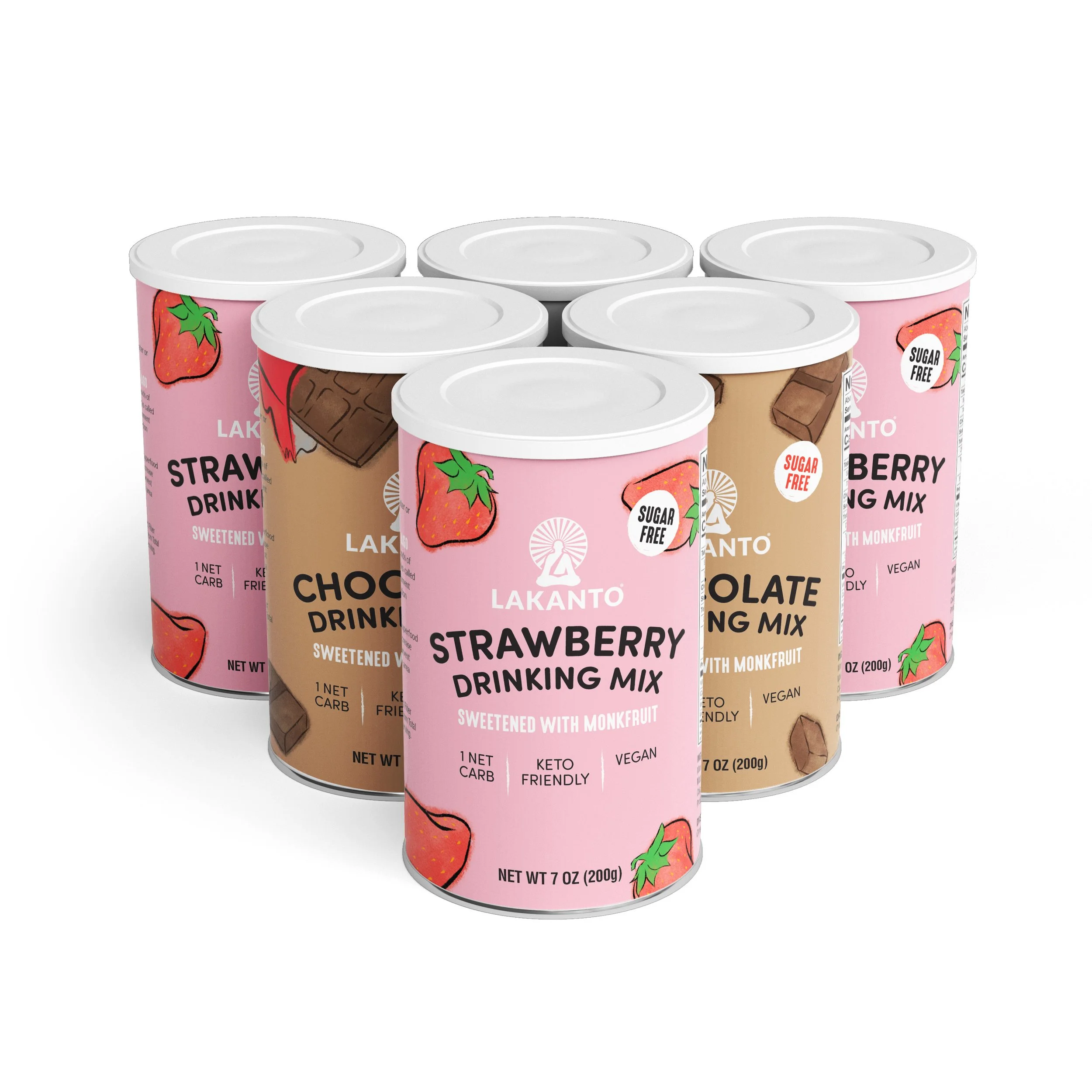

Respect your Demographic
The Kids Line of drink mixes needed an equally tasteful treatment but in a more playful way. When creating these, I wanted the design to appeal to both children and parents alike. I illustrated ingredients in a painterly manner in Procreate and paired them with large hand-drawn type. The Creative Team agreed that we needed to respect a child’s intellect by avoiding cute animals and cartoons on the packaging.