Chocolate & Caramel Sauce
PROJECT DESCRIPTION
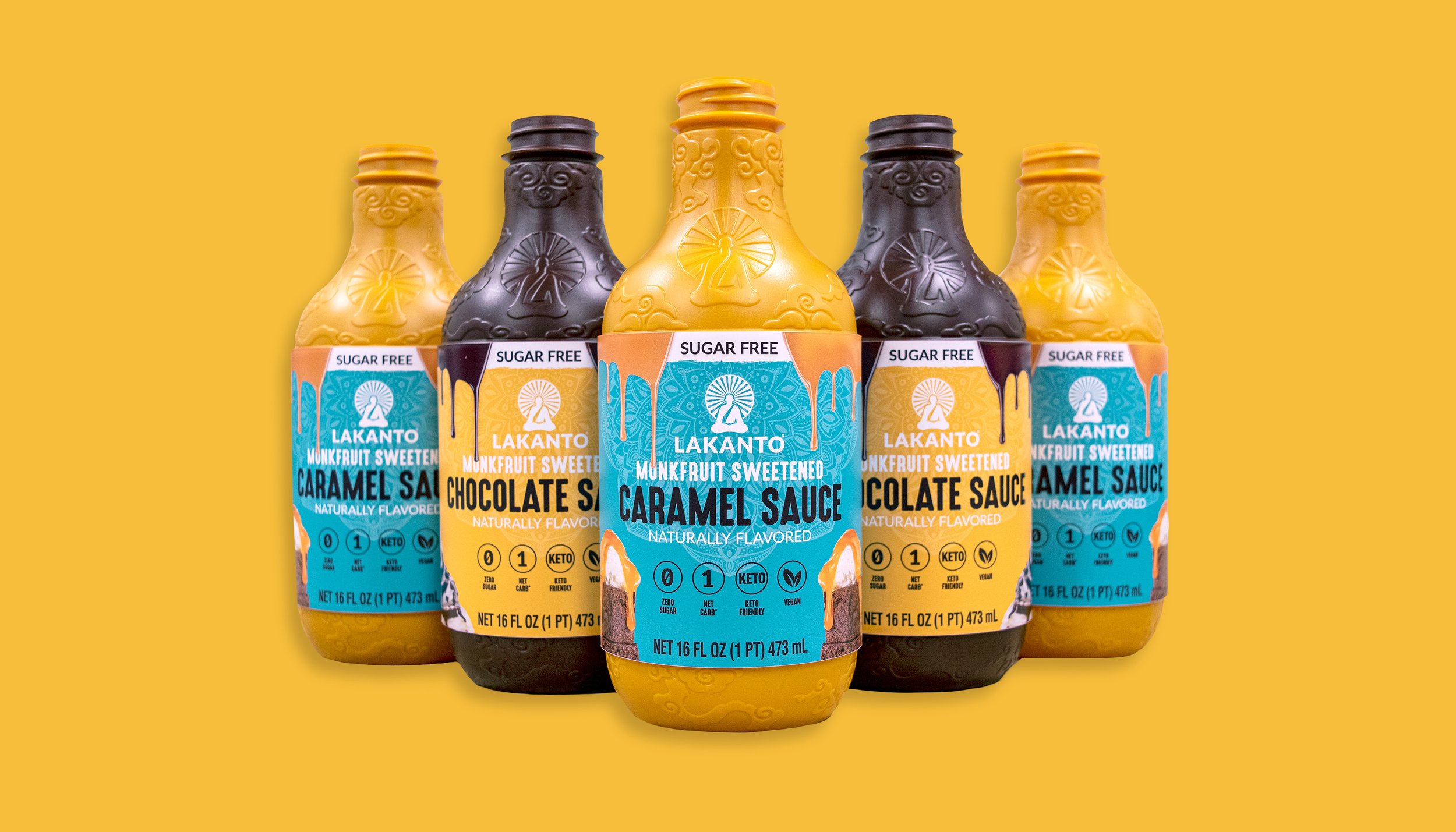
An extensive packaging project at Lakanto that encompassed industrial, packaging, and production design that I took part in. Lakanto had an existing Chocolate Sauce product but wanted to personalize the product line. Caramel Sauce was a brand new product to add to that line. I was involved with each step in the process up until it’s official production.
COMPANY
Lakanto
YEAR
2021
CREDITS
Jon Bybee | Creative Director
Kaila Poulsen | Art Direction
Chase Hauver | Photographer


Flavor Indicator
Early on in the process, I spent an extensive amount of time with how flavor could be communicated through color. It needed to compliment the yellow Chocolate Sauce label but not clash with the caramel color of the bottle. Turquoise was the best color for this product. It’s a unique color for product shelving and harmonized well with Chocolate Sauce label.


Bottle Color
Other than indicating the flavor through the label color, there was a debate on the treatment of the bottle. Production costs could be reduced if the bottle was an iridescent white or they could be unique with distinct bottle colors. Despite the cost savings, it proved to be more beneficial to have unique colors for each product. The sauces would stand out more on shelving and the drips on the label would match the bottle colors.
